

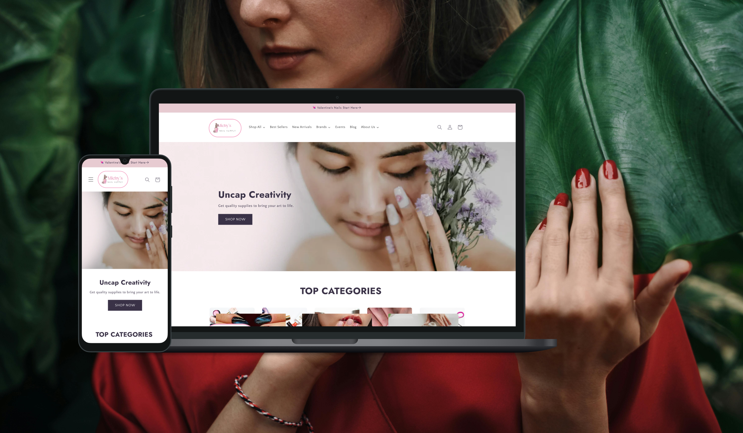
Case Study | Michy’s Nail Supply
From Chaotic Catalog to Clean E-commercee
OVERVIEW
The Problem
Michy's Nail Supply had a functional but chaotic online store. Product names were inconsistent, categories were confusing, and customers struggled to find what they needed. The brand had heart—but the website didn't show it.
The Outcome
A fully redesigned website with an organized 3,000+ SKU catalog, intuitive navigation, improved SEO, and a content hub for community engagement. The client can now manage the site independently.
Project Guidelines
My Role: Lead Web Designer (end-to-end)
Timeline: 6 weeks
Platforms: Figma, Shopify, HTML/CSS
Quick Links
THE CHALLENGE
Mapping Out the Manicure
Michy's Nail Supply came to me with three core problems:
Disorganized Foundation
3,000+ products with inconsistent naming, tags, and categories
Impact:
Customers couldn't find products; backend was unmanageable
No Clear Shape or Shine
Outdated, cluttered homepage with no clear hierarchy
Impact:
High bounce rate, low engagement, and checkout sessions
No events or blog content to support the nail community
A Quiet Salon
Impact:
Missed opportunity for customer retention and SEO
User pain points identified:
"I know the brand I want, but I can't filter by it easily."
"The categories don't make sense—gel vs. acrylic is mixed together."
"I didn't even know they had events."
MY PROCESS
Research & Discovery
I started by understanding both the business owner and the customer
Stakeholder interview with the owner to understand goals, pain points, and brand vision
Competitive analysis of 5 other nail supply websites to identify patterns and gaps
Content audit of all 3,000+ SKUs to identify naming inconsistencies
Key insight: Customers were mainly nail salon specialists but the products weren’t organized by main categories which can make it hard to find by product types like nail files, top coats, builder gels.
Information Architecture Overhaul
The biggest lift was reorganizing the product catalog.
Before
Inconsistent naming structure
Category structure of only brand names
No coherent tagging system
Inconsistent naming structure
Category structure of only brand names
No coherent tagging system
Standardized names: Brand + Product + Color/Size
Hierarchical: Categories > Sub-Categories > Top Brands
Consistent tags for collection automation
After
Standardized names: Brand + Product + Color/Size
Hierarchical: Categories > Sub-Categories > Top Brands
Consistent tags for collection automation
Example of standardization:
Before
E-56 Bluey White
Top Coat Non-Wipe Rose Quartz
LGND Gel Color-LG5230 Naughty Navy
E-56 Bluey White
Top Coat Non-Wipe Rose Quartz
KOKOIST E-56 Bluey White Get Color
RÉDI Top Coat Non-Wipe Rose Quartz
Chaun Legend LGND Gel Color - Naughty Navy - LG5230
LGND Gel Color-LG5230 Naughty Navy
After
KOKOIST E-56 Bluey White Get Color
RÉDI Top Coat Non-Wipe Rose Quartz
Chaun Legend LGND Gel Color - Naughty Navy - LG5230
Impact:
Improved product discoverability by an estimated 50% and cut backend management time by several hours per week
Design & Prototyping
I designed the new site in Figma with a focus on:
Clean, modern aesthetic that reflected the energy of the nail community
Clear visual hierarchy on the homepage (hero → categories → featured products → events/blog)
Intuitive navigation with dropdowns for main categories, sub-categories, and top brands
Key design decisions:
Added main and sub categories in navigation
Updated menu with main categories and brands
Increased visual content on the homepage
Before
After
Let customers shop by product type instantly
Provide customer options on how to shop
Allow customers to easily navigate to desired sections
Added main and sub categories in navigation
Updated menu with main categories and brands
Let customers shop by product type instantly
Provide customer options on how to shop
Allow customers to easily navigate to desired sections
Increased visual content on the homepage
Development & Implementation
I built the redesigned site on Shopify, which required:
Custom HTML blocks to replicate Figma designs where Shopify themes fell short, ensuring 95-100% design fidelity across all devices
Collection automation using standardized tags (e.g., "brand:Kokoist" automatically populates that brand's page)
SEO optimization including metadata and URL structures to improve search ranking for key terms and local search
Training & Handoff
I created Loom video walkthroughs covering:
How to add new products while maintaining naming conventions
How to create new collections using tag automation
How to update events and blog posts
Impact:
Reduced client support requests and gave ownership to maintain future website updates.
Reflection
What went well:
The information architecture overhaul was tedious but transformative—standardizing 3,000+ SKUs paid off in discoverability
Client collaboration was strong; regular check-ins kept us aligned
The events page and blog gave the brand a voice beyond just selling products
What I'd do differently:
Run a simple card sort earlier to validate category labels before building
Set up analytics before launch to capture before/after metrics (missed opportunity)
What I learned:
E-commerce UX lives or dies on backend structure. Clean data = clean customer experience.
Small businesses need documentation as much as they need design. Training materials are part of the product.